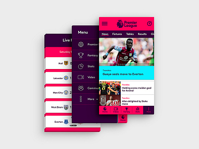
Premier League Mobile App Design
Home screen, menu and results screen designs for the official Premier League app. Main goal is to keep the design as simple as possible while implementing the new vibrant bold branding, in a content-heavy home screen. I don't have the official Premier League font, so I used another typeface with similar characteristics.
The official PL app was not yet released when I was working on this design. It was surprising to see that it is actually quite close to the official design in a few ways. However I think that the current official app acts more like a mobile version of the website, rather than acting as a native app. It contains many different content on the home screen such as fixtures, league tables and videos, which may create an overwhelming experience for the user. I aimed to use the tabs and menus for a smooth journey, instead of making the user scroll down a lot.
This work was done as a trial project.


