Apple Music
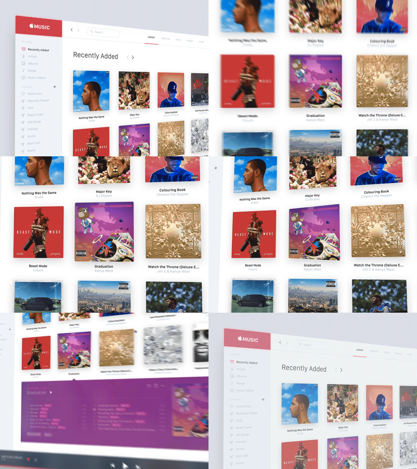
This is a concept for Apple Music as a desktop application which would replace iTunes to make a more consistent experience between Macs and Apple's mobile devices.
The layout for this particular screen is somewhat similar to the current iTunes as I feel that the only way to enhance the user experience here is by giving the elements more space and room to breathe. The play bar has been moved to the bottom to give it, it's own dedicated space which also gives more room at the top for the main navigation.
I have included a new social feature to show when a user shares an album or song they really like etc.
The animation shows how a user can interact with an album in a cool way, the idea for this came from Apple TV which is again another way of tying the Apple services together.


