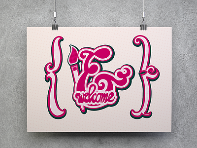
& Welcome
Poster for a local sign painting exhibition. Brief required to base the design off of one letter so I chose & (a "fake" letter that results from an e and t mushed together). It's a staple letter and a staple word. The old-timey way of writing "&" also gave me a lovely opportunity to pay homage to sign-painting with lots of curves. I finished it off by adding a simple paintbrush and welcome sign that together make a simple and clear whole.
More by Lea Marolt View profile
Like
