Web Footer Side Menu


So, there is this huge debate about using menus/navigation drawers on digital design. For desktop and mobile, we now learned to avoid them.
But at @23 Design, we don't care at all about large posts on how those menus only decrease interaction with the product. Those products they showed were different from the ones we design (or maybe not). And we like to challenge everything in the world.
I like to think design patterns as tools for the users to achieve tasks. Important tasks most be obvious, but that doesn't mean we need all the tasks to be obvious.
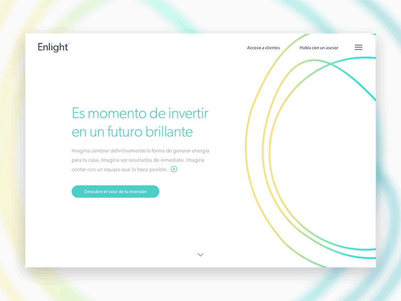
In this product, we experiment with that idea. What if the footer is no longer a footer, but a menu? We had some items the user most see and use, but there are others that may exists with a low level hierarchy the user don't need in that context. Is not a new idea, but in this product, the question remained obvious for the objectives.
This is the implementation of that idea, with all the boring navigation items of the site hidden from the user, and the items we wanted the user to use, remaining visible.
Yes, the obvious answer is using a footer. We just wanted a different approach for different objectives, the ones that fits better for this product.
Don't forget to add your opinion about side menus on the comments.