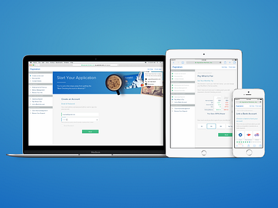
New Aspiration Signup Flow
Today we began rolling out a new signup flow for new people joining @Aspiration.
Because of the kinds of financial products Aspiration offers, we’re required to collect a lot of information from folks. Currently, we collect all of this info on just a couple of really long pages.
This new flow is split up into smaller pages, each focused on a specific type of info. The goal here is to make it less overwhelming for people, and hopefully harder for them to get lost. (Right now, lots of people get lost with all of the scrolling. ¯\_(ツ)_/¯)
It’s also going to be easier for us to rearrange and refine individual sections, and figure out what works best to help people navigate and complete signup quickly and easily.
We added a progress bar on mobile, which then expands out to a checklist on larger screens. Additionally, we capped the width of the form to about 430px to keep things from feeling too dense at larger widths.
We’re currently testing the new flow with 25% of people signing up for our Summit Checking account. We’ll then compare performance against our current long-form signup flow, and make adjustments as needed before rolling out further.
If you sign up for Summit Checking and get placed in the new flow, let us know what you think of it!


