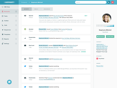
Design for sales activity dashbaord
I recently worked on a redesign the activity feed inside a sales platform. With such a dense amount of content, the main goal was to make it easy to pick out important information like activity type, the people involved, and any linked entities.
A more tabular approach wouldn't work, because people and entities are listed inline using natural language. So you can't just pull out the names and list them on their own; if you do, the way each item is written will break.
Instead I styled names and entities differently, with a priority on names. Styling the remaining links separately makes it so that the sentence is still readable, but link types are immediately evident, and somebody looking at the activity feed can scan it for important info really quickly.

