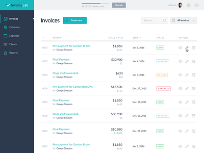
Invoices List - WIP
A work in progress of simple invoicing web app that I'm working on.
And there is always that hesitation: “Should I put the avatar/settings/logout part in the top-right or bottom-left corner.” It seems putting in in the bottom-left corner would create more vertical space for the main section, yet users are already familiar to search their profile-related info/action at the top-right corner. I decided for the safer approach… for now.
———
You are always welcomed to visit my official portfolio or check out my biggest side project.
More by Zlatko Najdenovski View profile
Like
