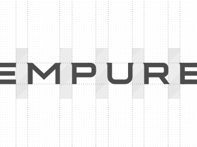
Empure
Working on a new wide squarish typeface with a classic scent designed from scratch. It's for a new brand called Empure. At a later stage the brand probably best accompanied with a more robust heraldic mark.
Edit: At this point I even consider making all the extra glyphs, punctuations and kerning pairs as well, but as you know time is somewhat limited again. I might need a little bit of help from you guys I think. . Anyway, I'm working on the logo now. More about this later guys....
More by Gert van Duinen (Cresk Design) View profile
Services by Gert van Duinen (Cresk Design)
Like
