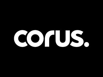
CORUS
I designed this logo over at Troika Design Group.
Yes, it reminds people of the Corbis logo but the client was really loving the way it looked and they were correct. We thickened it up and made it a strong, confident word mark.
The client also wanted to add the dot at the end, to give it that something something.
Call it an accent, a planet, a dot, a period... I like it.
Google the old logo it replaced and let me know what you think. ;-)
More by Caspar Nonner View profile
Like


