The concept is dead...
....long live the concept!
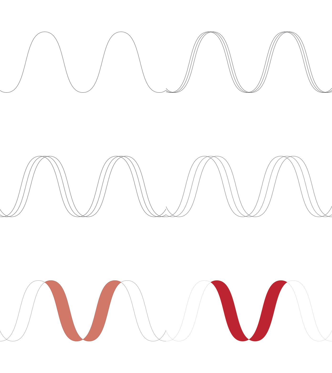
This is a recently created mark that was part of a company-wide rebrand. The new company name was synonymous with energy, power, and sound: it started with the letter V. This concept was very modular. I created several versions of the V, which were all part of the brand standards: the application(s) was driven by context of use, materials that were used for production, etc.
However, the client chose to go with another concept, which was a more straightforward visual execution of a mark rather than a concept which had a direct connection with the name. The client also asked that I not mention the new name. Therefore, all I can show is this. They were still very happy with the new visual identity that was created around the new mark.
