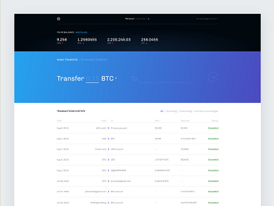
Snapcard Wallet Concept
Couple weeks ago I was asked to make a concept of bitcoin wallet based on existing design created by developers.It was a fun little project and I'm happy to share some details.
The design is not 100% polished but hopefully it's better then the old one. 😉
What I changed in the wallet besides visual design:
1) I created more clean structure and hierarchy of elements
2) I emphasized make transfer section as it's the main action in the wallet. We want users to make more transactions. I changed logic of this section to make it super clear - you'll take this much here and transfer it there.
3) I got rid of unnecessary elements such as history link in the header (we have table on this page, it will be Ok just to add {show more} button)
4) I reorganized columns in history to make it more usable.
5) I added a way to see currency charts and trade currencies right inside the wallet to encourage users make more transactions. (will post it separately)
Check the attachments to see both version and please let me know what you think about it!

