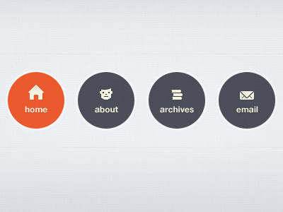
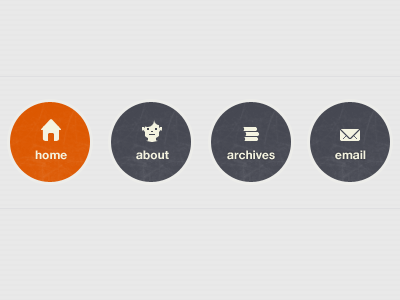
Navigation Element (web icons revised)
Ok, thanks to the feedback I received, I've tweaked and fine-tuned the icons. I've mainly altered the "home" and "user" icons. I'd love to hear your thoughts especially on the "user" icon. Does it still look cut-off?
Other than "fine-pixeling" I've also added more depth to each icon.
Oh, and they're correctly aligned now. :)
More by Maleika E. A. View profile
Like

