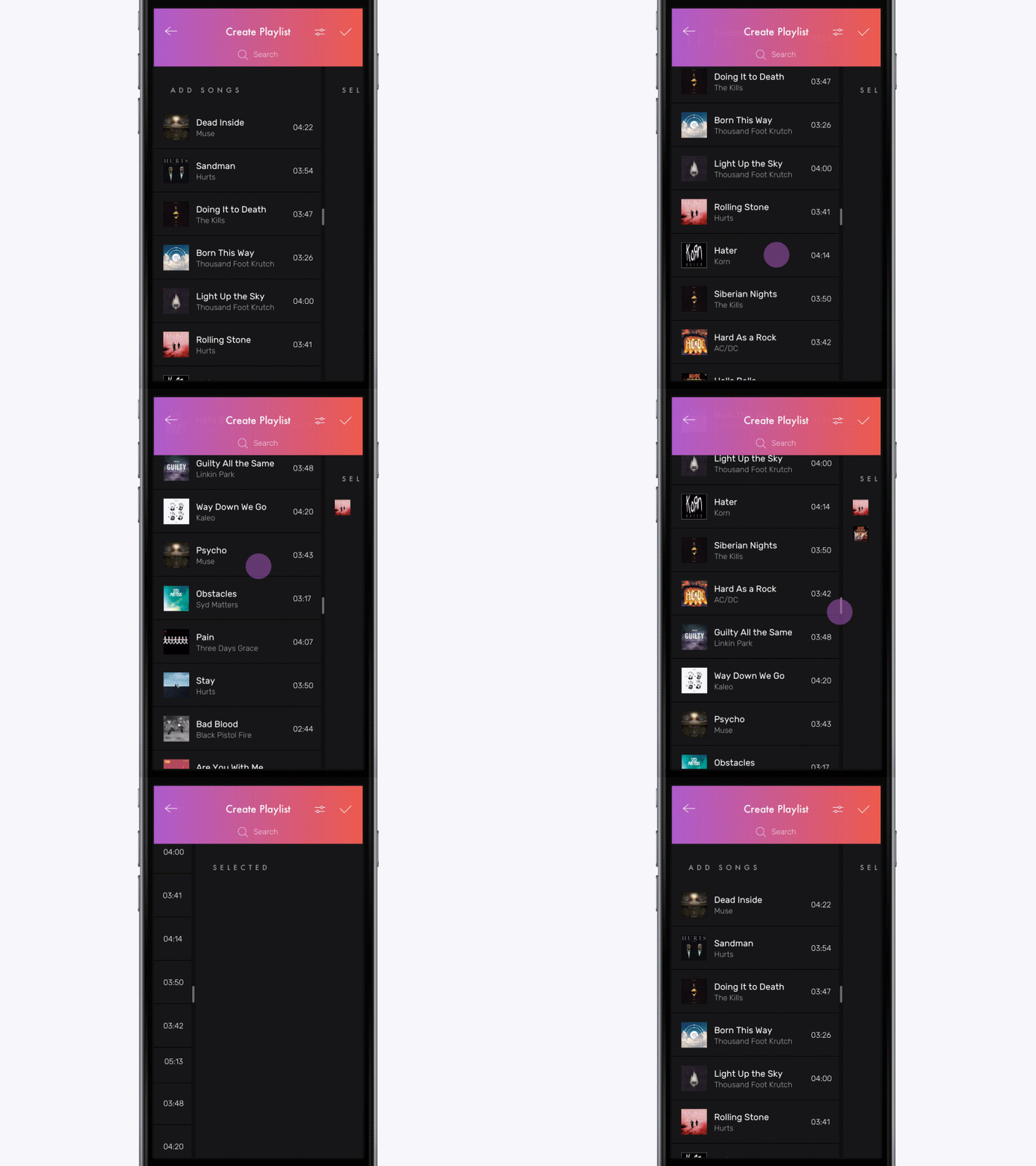
Multi Selection Experiment
Multi selection can be tricky on mobile. Default solutions, where you have a list with check boxes at the right behave bad when the list is getting real big and gets more functionality like filtering, for example.
In my little experiment, the screen is divided into two parts, so user can always see and manage what he selected without leaving current view. As for filtering or else, it applies only for main left list.
Made in Principle.
More by Yalantis View profile
Like
