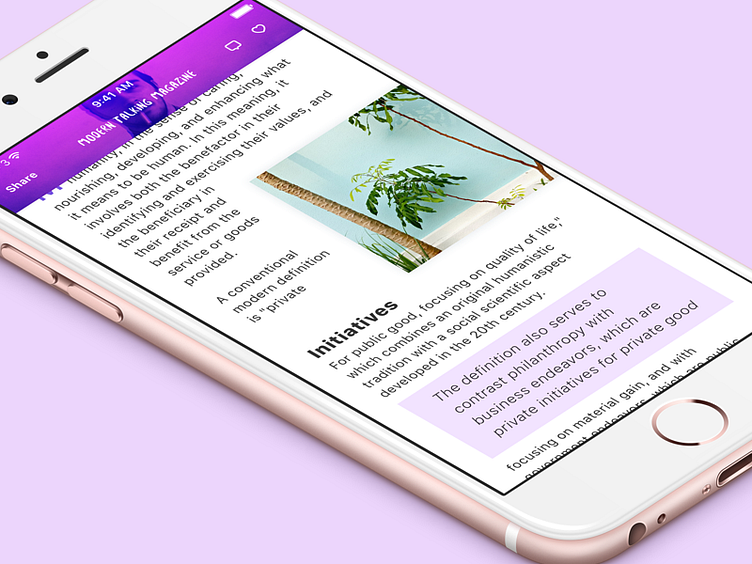
Modern Talking Magazine, scrolled
Had some spare time to get back into Sketch and play. Inspired by iOS10 boldness mixed with a bit of story telling and the best of the typography of iOS10, I've created this small magazine post
This is the second shot. This displays the article when scrolled. The header compresses into a normal top bar, with the share, comment and like feature added.
More by Simon Busborg View profile
Like
