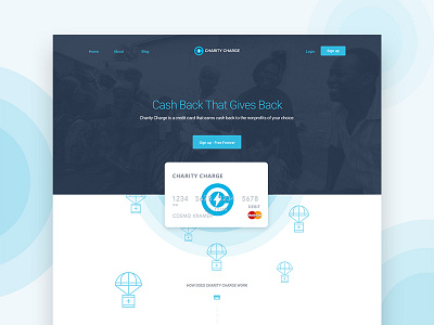
Charity Charge Website
I thought the little parachute care packages floating down the page was kind of a nifty idea.
The rest of the website is pretty clean and utilizes circles and that radar pulse element as a constant branding element.
More by Charles Haggas View profile
Like

