LinkedIn job search UX issue
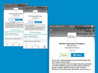
While searching for jobs in Dubai I've found this UX issue with LinkedIn's job search. In this case I've used the iOS version to show what's wrong and how it can be fixed.
In some languages, like English and Portuguese, the feedback from the button state changes only adds or removes a letter.
I believe this is not enough for users to notice so I did a quick mockup on how the button could change. A simple color change and an icon added could make this action better.
As I said, I'm currently looking for jobs in Dubai so if you know anything please drop me a message, you could also check this website www.dontleavemehere.com which I created in order to get more referrals and connections in Dubai.
Thank you!
More by Rodrigo Franco View profile
Like
