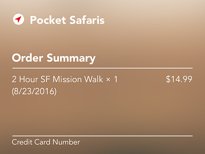
Daily UI Design Challenge: Day 2 - Credit Card Checkout
Created a simple credit card checkout page for a Pokémon Go meet up-type group. @Emilia Regan correctly pointed out that the Order Summary is too similar to the input field areas, adjusting the sizes might have helped there, or perhaps a background color for the summary?
More by Christopher Kennedy View profile
Like

