Marketing Education Landing Page
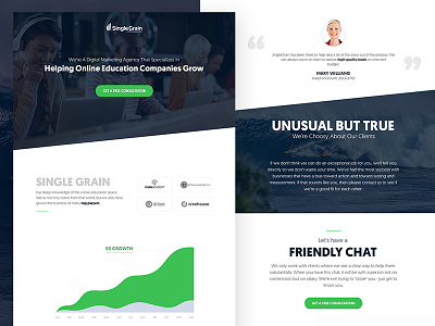
Who said landing pages have to be boring? This is a design we've done for Single Grain, a well known marketing agency.
They are targeting education companies and startups that are disrupting the industry.
With the design we had 2 goals in mind:
1. Create a landing page with a high conversion rate.
2. Create a stunning design that will amaze the visitors and establish Single Grain as a cool and different player in the education marketing space.
We've looked over the top education companies and noticed that all of them have a hip/cool look and attitude. They're basically disrupting and reinventing the education from the boring state where it is right now.
That's why we intentionally chose to create a cool design with fresh imagery. We think it will connect with to the audience they're trying to connect with.
Check out the detailed design in attachments and don't forget to L :)

