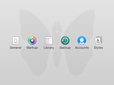
Custom Ulysses Preference Icons
I had just installed Ulysses, and was really enjoying myself until I opened the Preferences window. And then BAM! I saw the icons. As per usual I was less than thrilled to see randomly sized, blurry and old style icons. The icons are fantastic everywhere else in the app (including a brilliant Butterfly App Icon), but for some reason these little guys were neglected :(
Right then and there I knew somebody had to do something. I looked around for a hero, but sadly there were non to be found, a million miles from the nearest habitable planet in the vast darkness of space… wait that’s not right. There were non to be found in the less than vast crampedness of my office. It was just me and the dog. And I’ve never seen the dog do anything heroic.
So I took it upon myself to take care of the problem.
General
I tried out a new rectangular design for the light switch. I realized I'd never seen a square shaped light switch in my life. So I'd better stop drawing them :)
Markup
I wanted to have more detail than just a plain color wheel. So I added a knob with an arrow. Kind of a play on the idea that someone would choose a color by turning a dial.
Library
I liked the concept of the original icon, but the text was blurry and unpleasant in the original, so you know I had to fix that. RIght? Right.
Backup
I considered changing this as I'm not a fan of the colors used for macOS Time Machine/Backups. But I decided it's probably best to keep them similar for recognizability sake.
Accounts
The original icon was and "@" symbol. I think that works great for just email accounts. But the Accounts in Ulysses are things like Dropbox and WordPress. So I've swapped out the "@" for a "Person/User" icon, as I think it better represents an account with out being "Email" focused.
Styles
Besides being stylistically out of place, the original icon also felt flat and singular. I created a new two document/set approach, that is more respective of "styles" (implying more than one). And I included a blue underline to better show that not only fonts are changed via the Styles options, but other things like background color as well.
