Google Fonts Improvement Project: Maven Pro Black /g
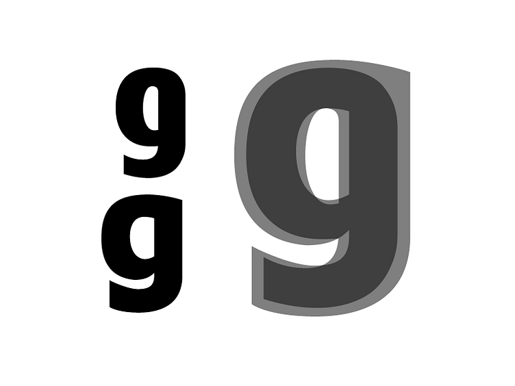
Original on the Top Left Adjusted on the Bottom Left Overlay on the Right Spent the day expanding out the the full alphabet. Did spend time fiddling with the stroke contrast in the Black master. Also fiddled with the squareness in the rounds.