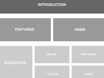
Si Architecture
Moving into Fireworks, I've now started working on the grid and information architecture of my personal website.
The darker sections are the more important elements whilst the lighter sections less so. The order of each section reflects the importance of the content (to me).
Like most websites, I'm adopting the 960 grid system for simplicity and flexibility, 20px gutters between each section, double for each group of sections for clear separation.
I'm not focussing on colour, style or typography at this stage, just layout of the content. It helps me to not get distracted by the aesthetics.
More by Si Jobling View profile
Like

