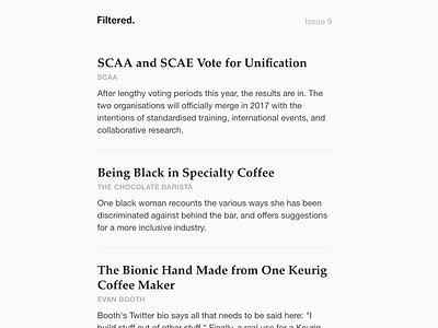
Filtered email design
Every Sunday morning, I ship a new issue of Filtered, my curated specialty coffee newsletter. The layout has slowly been evolving over the past few months to this current iteration.
In designing Filtered, I wanted to set the newsletter apart from whatever else is in a recipient's inbox and make it feel good to read. But I also wanted the design to be ignored and let the content speak for itself.
One of the fun challenges of email design is typeface limitations; webfonts are out of the question except a few edge cases. The sans serif on Filtered is Helvetica/Arial, coupled with Palatino because of its character and great support across operating systems.
Desktop and mobile screenshots are attached – from a live, coded campaign, not out of Sketch.


