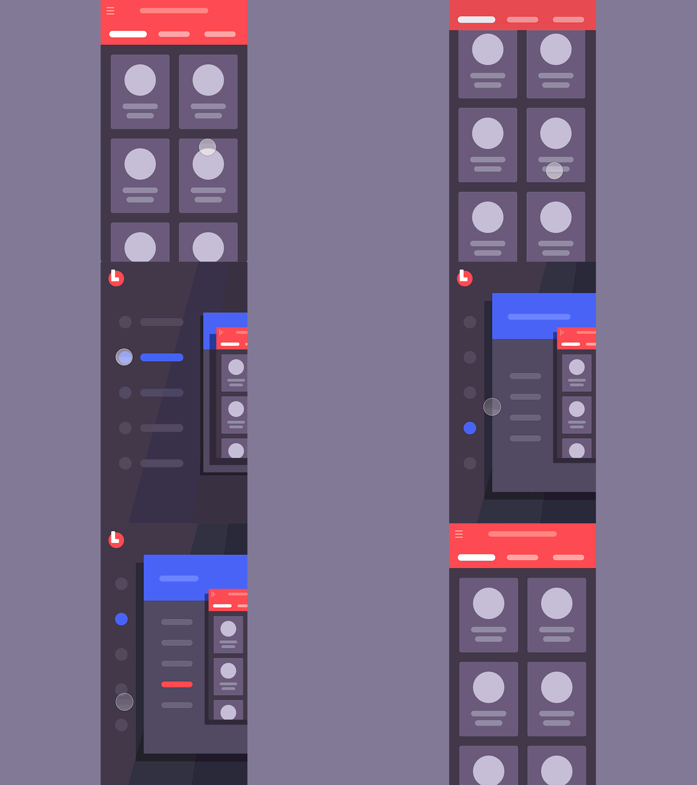
#2 Double Menu
Hey again,
Here you can find the double menu approach which might come along very helpful for a complicated systems with a deep hierarchy. Or you can just store another stuff there, some like favorites list, quick orders or pretty much anything that you think might be worth 1-2 clicks access throughout all your app.
This very shot's been prepared as a pattern of my past project where we needed to implement deep hierarchy one. That's why those menu items look mutually related.
Behaviours You can see that first lvl menu only has icons depicted by default. Tap & Hold wld release supportive captions where you can select without lifting up your finger. Or you can have one tap selection right away with no holding and waiting that extra second.
This shot is being a part of so called interaction library, launch of which's been announced at my previous post.
Interaction library would aim a few main targets: - Quick access to the example of a generic interaction you can quickly share with your client to get a reference point on the table; - It’s easy to select and implement a behaviour type that would be suitable for a particular project you work on, as i’ll try for them to serve a typical UX need; - I will as well try to cover the most interesting and non-standard approaches to explore relatively fresh behaviours so we all stay mainstreamed and aware; - I do love create nice and smooth interactions and so now i have a chance of doing that independently of the project i currently work on most of my time :)
P.s. Hope that is any helpful, hit "L" if you feel like it :)
