Calorado - Weekly Calorie Tracking Visualization

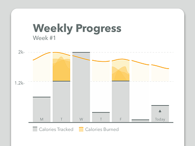
This visualization shows a user's weekly tracked calories. The goals are to encourage users to consistently track all of their calories, each day of the week, and to eat within a healthy range for their body type (e.g. not so many that they gain weight, not so few that they're hungry).
Research shows that people are more likely to complete a goal if they're given a range to aim for, rather than a hard number (e.g. "I want to save between $100 - $200 next month" is more effective than "I want to save $150"). This visualization applies that insight to daily calorie tracking.
So as a user tracks calories for a day, the corresponding bar rises toward the yellow band. Once they've tracked enough calories such that they're in range, the yellow band illuminates, visually rewarding them for tracking their calories and staying within range.
Presenting daily calories within a weekly context helps users stay mindful of how their daily efforts contribute to their longer term weight change goals. This encourages more consistent tracking throughout the week, gently discouraging missed days or splurge days, but provides a sense of forgiveness when those days inevitably happen.
The burnt-yellow line across the top adjusts, day-by-day, to represent the upper limit of calories they have for the day if they want to hit their weekly calorie deficit goal (e.g. if the user splurges on Wednesday, the line shows them how to gently get back on track for the week).