Toggle filter
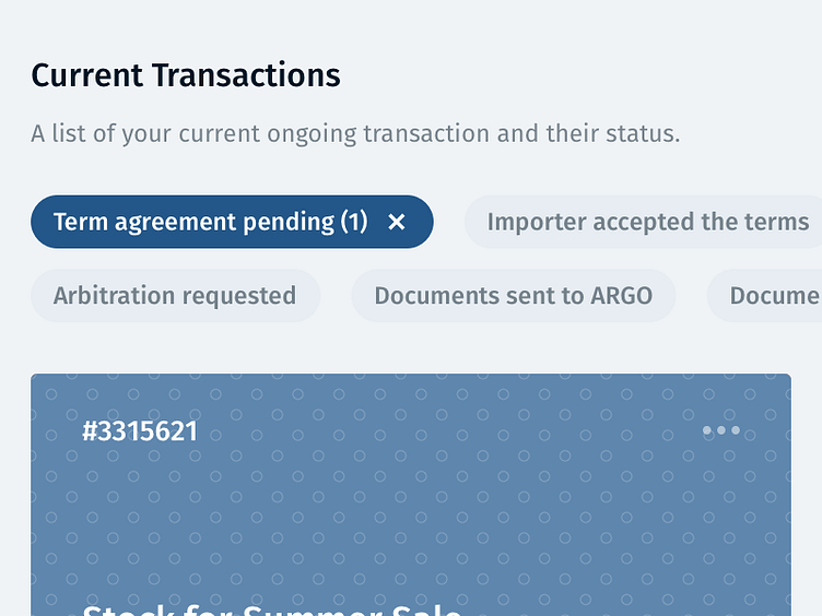
With a list of transactions it can be difficult to filter them by status.
We opted for a straight dropdown (which would only allow to filter by one status), but after getting feedback from our customers, we realised it would be more powerful to allow them to filter by multiple statuses.
Shown here is a snippet of that, showing all the possible statuses and allowing our customers to toggle each one.
More by Paul Mackenzie View profile
Like
