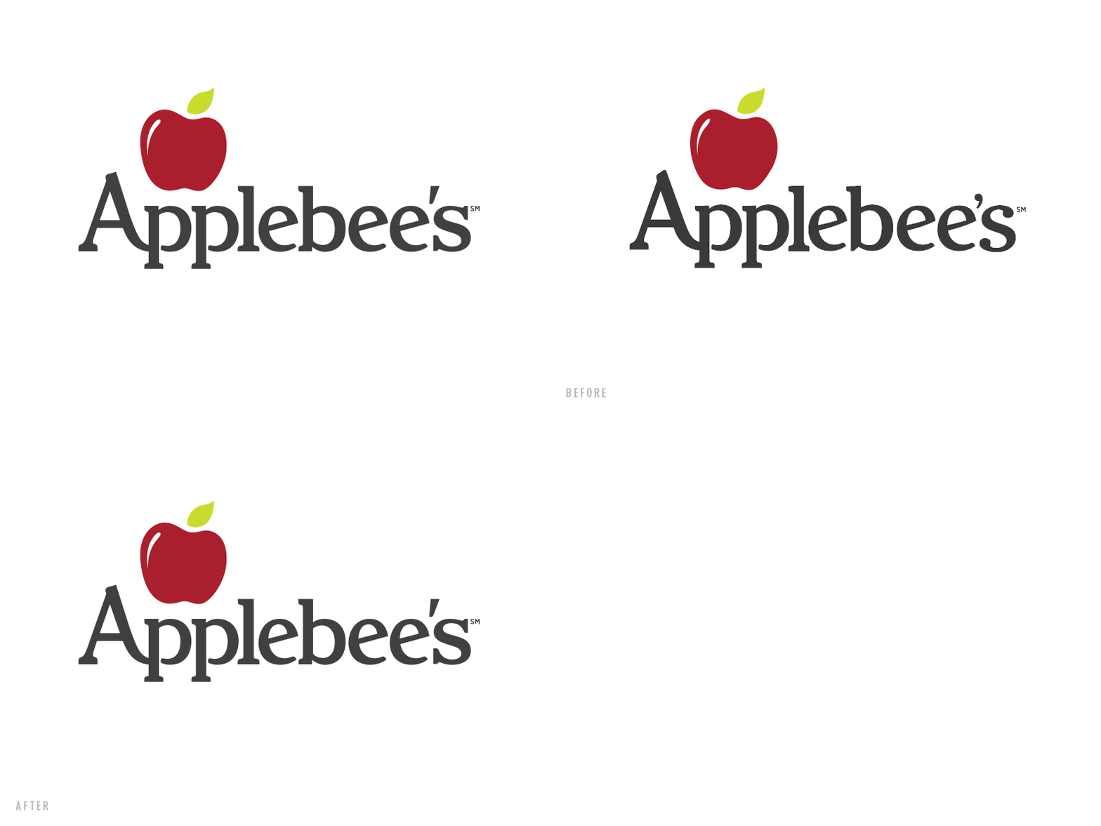
Applebee's Logo Refinement
This summer I was fortunate enough to get to work on a fresh update to the Applebee's logo. The ask was for an overall cleanup without it feeling like an entirely new logo. With direction from Shanon Wille, I focused on establishing a clear language across the serifs, unifying the weight of individual letterforms, and aligning everything on a consistent baseline. The client had a few tweaks but it has been cool to see it roll out over the past few months.
Big thanks to:
Shanon Wille - Art Direction
Travis Kramer - Creative Direction
Blacktop Creative - Agency
More by Jason Wright View profile
Like
