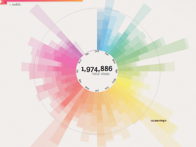
"Kodachrome" - Dynamic Health Data Visualization
Dynamic / interactive data visualization showing a person's physical activity over the course of a year. The goal was to help users celebrate consistent, long-term self tracking. Each spoke represents a week of activity. The spokes are composed of overlapping, bars representing total steps (or calories) for a given weekday. The reference ring represents either a target count or the user's average count, whichever is greater. Below the visualization is a calendar (not pictured) showing the performance for each day. Both the visualization and calendar could be interacted with for a more detailed view.
You can see more examples of the viz rendered here:
http://elih.co/kodachrome.html
Special thanks to Emily Dove for help with the colors and title. https://dribbble.com/emilydove144
