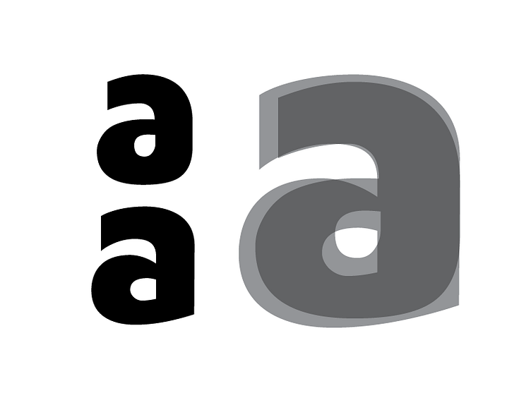
Google Fonts Improvement Project: Maven Pro Black /a
On to the next project: Maven Pro
Reviewing the design, the majority of the time will be spent working on the Black master of Maven Pro. Original Design on the top Left. Adjusted design on the bottom Left. Overlay on the Right.
Summary of direction:
• Increase x-height to harmonize with the Reg master • Increase stroke weight to make instances more pronounced. • Introduce a sharp transition for round to straight segments • Introduce rotation contrast in the Black master. (the middle bowl of the /a required this tactic.)
More by Thomas Jockin View profile
Like
