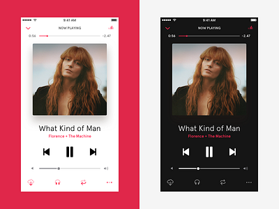
AppleMusic player redesign
I personally find that scrubber beneath the avatar in the current AppleMusic iOS10 version, annoying, so maybe it's better to put it on the top... Black edition as well - although looks a bit like Spotify ;)
Enjoy and Press 👉 L on the keyboard to show love :)
Thank you!
More by Dima Shvedun View profile
Like


