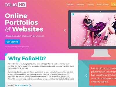
Refreshing the FolioHD website
Spent the weekend giving the foliohd.com marketing site a little bit of a facelift. I'm loving big, bold gradients, so the new site incorporates a bit of that, along with some blocky sort of elements below the fold.
Also new are the Features and Themes pages. (Be sure to check out the cool fading text gradient on the Features page!)
This was my first real attempt at using flexbox in the way it was intended, and I must say, I'm starting to become a huge fan.
More by Cory Watilo View profile
Like
