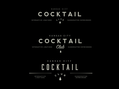
Logo Exploration
Hey everyone, need some feedback! I know this is the lockup style I'm wanting but I'm having trouble with some of the finer details. These are iterations of each other I've been playing with and I'd like some feedback on which one and how to polish that one. I'm not in love with the script font, but part of me is still clinging to it. Thoughts?
More by Alex Benson View profile
Like
