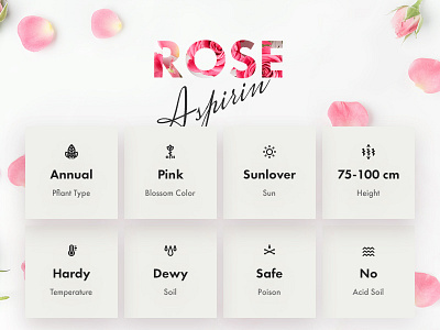
Plant page for garden blog
Hey designers,
Sometimes you are in the middle of situation when your ideal solution is at odds with what reality demands. So this is the case for this shot ;)
No matter how badly we as designers would like to implement the deepest desirable ideas and see them through. There is always something that is needed to be considered — technology, content, people, maintenance, budget etc. Lots of us complain about this but there is no right or wrong answer to the question about constrains. Moreover, they are always somewhere behind the curtain of each shot here on Dribbble so only few know they exist at all.
Posting these two designs here as a case in point. Top of fold area that could be and the whole page as it is now (in the attachment)
And how are you feel about limitations in your design process? Does it stimulates you to overcome them? On the contrary, these hurdles are the ones that make you struggle?
Looking forward to some bit of your love (L key ☝️) and participation in discussion 👇 ;)
Have an awesome weekend!

