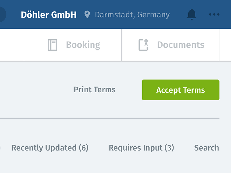
Header Alteration
Working on improving user focus with a different header here, as well as reducing vertical space.
Opted for a darker blue than before to reduce importance, and put more important information at the forefront.
More by Paul Mackenzie View profile
Like
