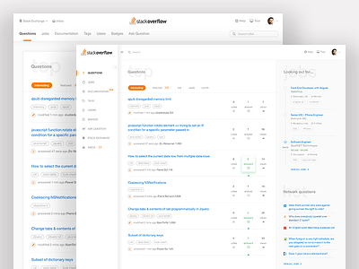
Stackoverflow redesign
Hi,
hope you all had a great weekend. I sat down to re design Stackoverflow as I was browsing for some help as usual and it struck me it might be a good exercise for weekend. I quickly spoke to a few fellow devs who access it a lot and took their feedback on current design. To my surprise, they like a lot the way current design is, the way it's simple. Which posed even bigger challenge and posed doubts in my mind whether to just design a great visual treat versus keeping the core values of Stackoverflow intact(not that i know about them a lot) and then approach the relevant changes. I sat down with my own evaluation primarily on how navigation across can be made more friendly and how responsive the design can be to support mobile devices. So a few major goals I identified in the time I had and took a crack at it.
- Primary navigation
- Secondary navigation
- Search more prominent and accessible
- Emphasis on jobs and how users can quickly start showing interest right away
- Remove Visual Clutter much as possible & create some character and consistency via iconography
I came up with two possible renditions to check what made sense and in the end I think, it's only user testing is what can solve it.
Huge shout to the @Stack Overflow team who I believe are doing a great job in making improvements as I do realise it’s really tough when you have a large user base to drive a very big change suddenly is a humongous task.
Hope you guys "L" it.
Stay in touch :


