Homepage Update
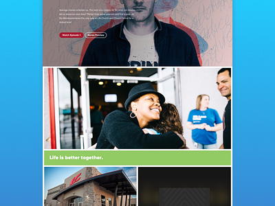
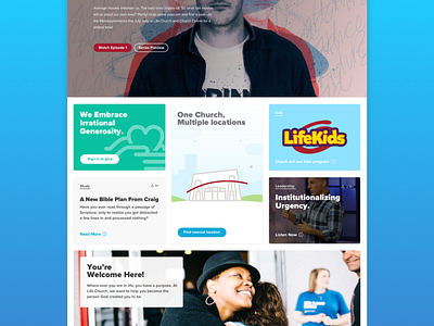
The thing about this type of layout is that the visual can quickly get chaotic. So in an attempt to reduce visual clutter, I've attempted to just showcase images that provide context of what's next.
Example:
Need info about a campus/location. The image of a campus/locaiton is your ticket. Tap/Rollover the image and typography gives more specific info and action to help guide the user.
Motion:
Looking to have a smooth simple effect when a section is active.
More by Ryan Tauss View profile
Like


