Yieldr
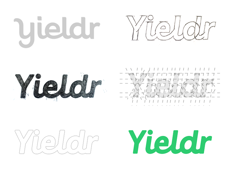
Super excited to show the work I have done re-designing the Yieldr word-mark. We aimed to keep elements/ideas of the previous word-mark alive with a fresh new appearance. (Credits to Rokas Sutkaitis on the previous logotype, left top)
Challenging part was the “Y” character as the tail in the previous logotype was causing problems on small horizontal display’s like for example the website. We choose to keep the rectangle shape box as much as possible and have gone for a traditional uppercase “Y”. Thought with the tail “Y” it is much easier to create a "standing out" character this suited way better in overall appearance, balance and looks more mature.
- http://www.yieldr.com/repositioning-to-make-every-flight-more-profitable/
More by Paul von Excite View profile
Like
