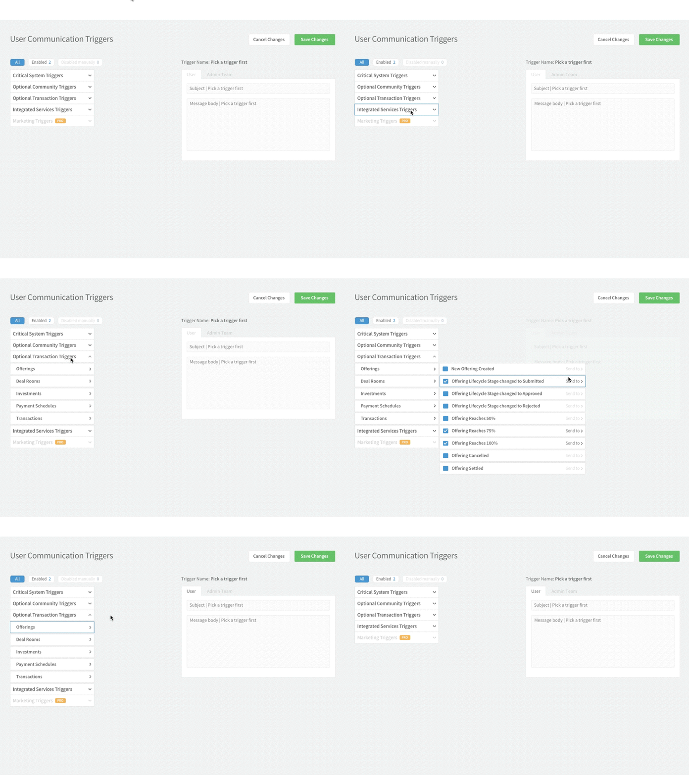
Advanced Search - Triggers page GIF
Hey, dribbblers,
I've recently started working on the redesign for existing web app, and the first page I had to work on is User Communication Triggers where Admin Users have to pick a trigger, pick a person who will be receiving the message and type in the actual message. It was really messy and triggers were presented as a large list which would require very inconvenient scroll. So, I've got rid of it by doing some simple grouping and simplified the whole process in general.
More by Timur Abbasov View profile
Like


