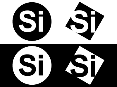
Si Badge
I'm toying with some ideas for a Simple Identity by playing with the letters in my name.
I'm (mostly) known as Si around the web and I was thinking about what my attitude was towards design.
I like simplicity in design but I also like to play with conventions some times.
The round logo is conventional but not necessarily the right direction for this.
The rotated square suggests conforming to rules and form with a rebellious side to it.
Thoughts?
More by Si Jobling View profile
Like
