Augmented Reailty
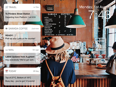
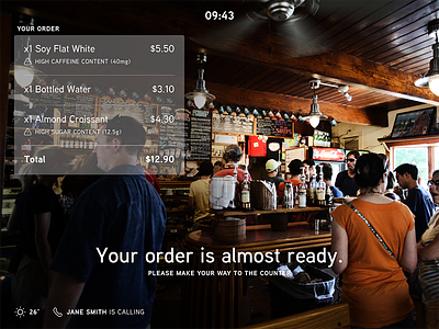
Based on @Mel Casey's work, I quickly conceptualised an augmented reality display, this time made to look like iOS 10's new UI.
📓: - vertical spacing between each notification card should be smaller - letter spacing for app name (in cards) should have more letter spacing - icons are not realistic of iOS - mentions Melbournian landmarks, but photo is set in Chicago
More by Enoch Appathurai View profile
Like

