Modal Dilemma
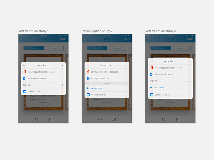
I am stuck. The first option is cleaner, but the add account action is a little obscured. The second one highlights all the main actions, but at the risk of making that 'View All' button small. The third one is complete and everything's in a reasonable size, but can be confusing and overwhelming to look at. Hmmm...
More by Celena Jasmin View profile
Like
