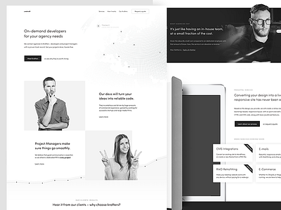
homepage wireframe
Was a while since I last posted a wireframe!
I've been working on a home page for a platform that connects design studios (and freelance designers) to talented front-end developers – most of you probably needed help with development at some point, and struggled to find someone who will do a good job at a reasonable price.
When looking for a developer, there are two things that matter most - first off, the quality of work, and then the price. An assumption could be made, that as the hourly rate rises, the quality does too - that doesn’t mean skilled & budget-friendly developers are impossible to find. Quite the contrary - the so called „emerging markets” are booming with talented people, but working with them could mean huge timezone differences, cultural and language barriers or other communication issues.
This is where the platform comes in - it has a group of cherry picked developers, who are supported by project managers. Those are attached to every project and are your single point of contact to make sure things go smoothly and you have the best of two worlds - great quality at a good price. That’s basically the platforms USP, but there are more advantages than that - easy scaling, great QA and so forth.
Since the service is targeted at designers, I thought it might be useful to run the wireframe by you first to see whether it convinces you. Does it do a well enough job to explain and sell the idea to make you request a free quote? (Who said that tests with real users should be expensive :D)
Visually, the layout is rather traditional, although I have some eye-candy planned here it there:
1. The dotted globe in the header. Some dots will be larger and clickable, representing freelancers & studios spread around the world, with connections being made between them (as animated lines). The globe itself is all vector, so I was considering to make it spin with a SVG animation, but that might be overkill.
2. The iPad - It’ll have two screens, one will showcase a responsive website design, and the other one it’s code. On scroll, they will move on the x-axis along with the case (which overlaps the final CTA to make things more interesting)
A concrete visual identity for the platform hasn’t been established yet, Mik is still working on the logo so nothing is set in stone. I like how the dev and PM are sticking out of the squares though, and thought that we could base the entire thing on that concept. The KV would always be a colored square with something (someone?) sticking out of it, the logo could follow that pattern. „Our devs are thinking outside the box - your agency should too”.
Spent well over 10 hours on this (had to write the entire copy, which took way much time than I anticipated), I’m fairly happy about the outcome - what do *you* think?

