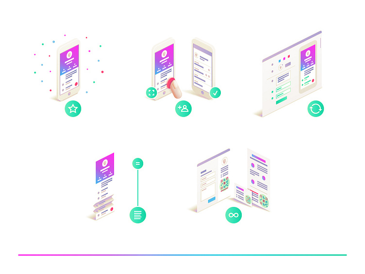
vCard Plus Illucons
Hey there everyone,
just wanted to share the kinda final versions of these illucons with you. Please press Z to view them at actual size.
I went back and forth with zooming on and out while working on these to get the balance between content/context and visual appeal just about right, if you wanna call it like that. Or to put it in other words: I tried to keep the size and amount of details (according to that size) in a good balance.
That's why the icons moved outside the ills a tiny bit compared to the first draft, just to set a calm pace for look and feel, slight tuned up then by the angles, colors (tweaked them a tiny bit), etc.
What do they represent? From left to write starting at the top: - Appealing Mobile Page - Adding contacts with a single tap - Update any time - Room for what you have to say - Endless Application Scenarios
Let me know if you want to know more about the process/thoughts or if you have any questions. I'd be pleased to answer them. Thank you very much for your time and attention.
