Chicago Sun Times Logo
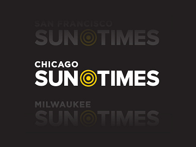


After establishing the overarching 'Sun-Times' brand, I needed to create individual logos for each city. Because of the vast amount of mediums the logo would be used on, overall flexibility was important—it had to work as an app icon, a newspaper masthead, a website header, and more.
In creating the main city logo, I placed the sun icon in the center of "Sun and Times, replacing the traditional dash '—' that was used in the original Chicago Sun-Times branding. This was done as an aesthetic choice, but also because the brand was dropping the dash '—' officially/legally. I though that placement was a nice nod to that.
As for city name place, I simply placed it above the mark. You will see in the version used today (2016), they chose to vertically stack the city name on the left-hand side, as well as dramatically decreased size of icon —I was not responsible for those changes as they were made after I left. (attached)
Also attached are examples of the app icon variations (main Sun-Times app and local-only versions) and truncated logo variation (icon + city name)