App Colour Design
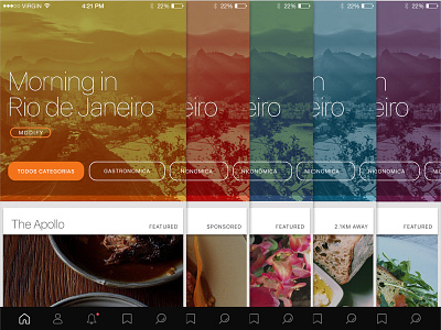
Designing a system to codify and define the UX for an app. This app helps people discover places around based on their preferences. I wanted to communicate how the app is dynamic and looks for the best places matched to the time of day in the location they are in. The colour helps with the emotional connection and adds a vibrancy that also functionally tells the user this this is dynamic and every changing. The colour and title welcome text change depending not he time of day. The entry point to any app is so important. This being the feed page it's important to have an into are that inspires and is fresh, the colour try to do this. I've then used a very simple monochromatic interface for the actual feed and the cards that represent each property. It's just a nice crips title and letting the image do the work visually. If they are attracted then they click through. I'm trying to design using a balance of vibrant rich colours for the intro with the crispness and minimal beauty of clear and functional information for the actual content in the cards. Let me know what you think? Thanks :D


