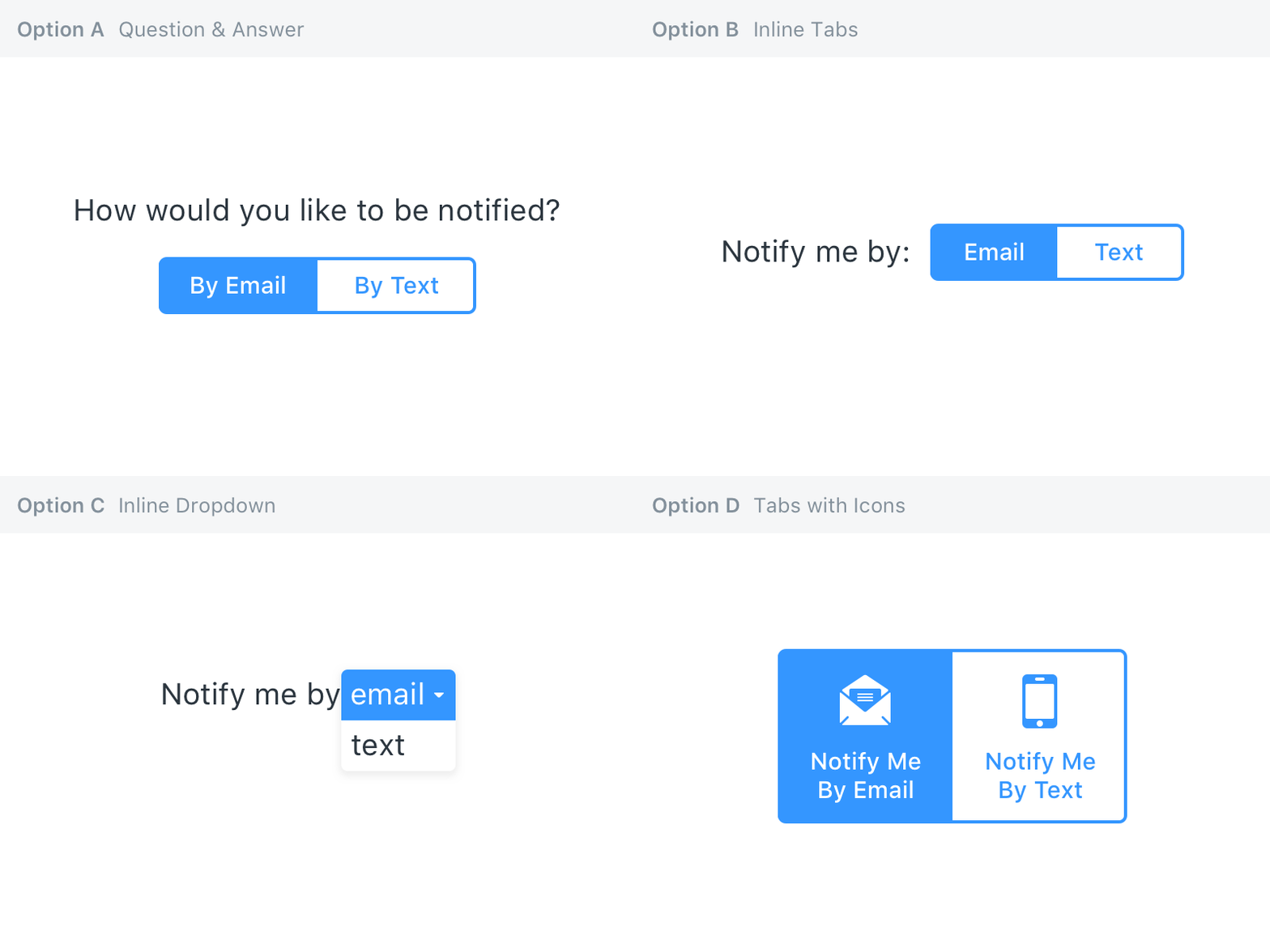
Notification Options
Testing a few different variations of an input that displays different options depending on whether you select email or text notifications.
Pros and cons:
Option A: Question & Answer
+ Most human. We, the software, ask “you” a question, which elicits an answer
+ All options available at a glance
– Repeats “By” in each tab
– Requires the most space
Option B: Inline Tabs
+ Requires less space than Option A
+ All options available at a glance
– Although it reads as a sentence, text size and styles are different between the label and the tabs
–? Different point of view from Option A. Instead of answering a question, you are completing a statement
Option C: Inline Dropdown
+ Very compact
+ Text styles for sentence remain consistent
+ No unnecessary information is displayed, once the choice is made
– Additional options not visible until hover or click
– Requires an additional step compared to other options
– Less touch-friendly than always-visible tabs
Option D: Tabs with Icons
+ Buttons are self-contained actions
+ No label required
+ Icons increase ease of identification
+ Generous tap sizing
– “Notify me by” repeated for each element
Which option do you prefer and why?


