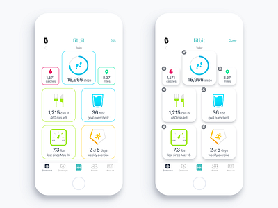
Fitbit Dashboard - Light
I've loved the new Fitbit's dashboard ever since it was updated. Just had a few ideas about bringing more clarity and unique aspects to it. Including, more colors allowing for better glanceability. As well as moving away from plain divider lines and adding a stroke around each category. This drives home the feeling of each category not just as a static image but as a button for the user to press for further information. Lastly, all categories and data are now viewable without the need to scroll.
More by Jason Zigrino View profile
Like
