Pokemon Go Redesign
I’ve recently been playing Pokémon Go (like everyone else on Earth) and I found it pretty nostalgic. However, I miss some aspects of the GameBoy games I fell in love with when I was a kid.
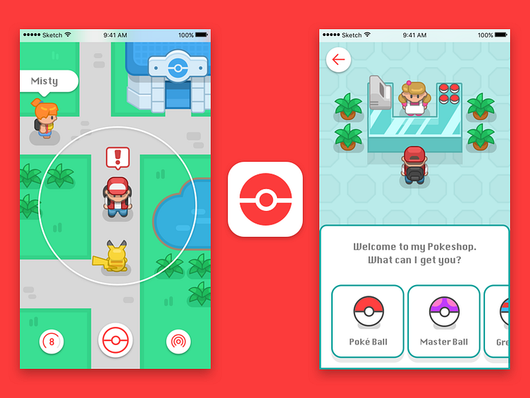
For this redesign I tried to pay tribute to the old pixel art style that I associate with Pokémon, but kept the clean lines of a modern vector illustration.
I also miss seeing other people/characters in the world while using the app so I thought it’d be fun to see where your friends are when they’re on a hunt.
Also, Pokéstops don’t feel like I’m stepping into another world like VR should - they feel like a different experience compared to the rest of the app. So I decided to trash Pokéstops altogether and make them into Pokéshops like the ones from the game.
Last but not least, it’s no secret that the Pokémon Go app icon feels a little blah, so I went with something simple yet recognizable - a glyph poké ball.
