Graph
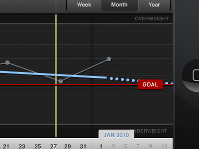
Rough mock of the updated graph view for Weightbot. It looks busy because all the elements are on screen at one time. The yellow line is the user set goal date. Still trying to think of the best way to symbolize the goal date iconically (is that even a word??) and possibly the red goal weight line as well.
Also playing with the Z-axis of elements. I know the red goal line needs to be on top, but not sure about the yellow goal date. I might move it to the back below the weight data lines.
More by Mark Jardine View profile
Like
