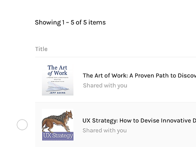
My content library WIP
Recently, my husband bought me a few books and shared through the Family Library. Since I was new, I needed accept the invitation as well as download the appropriate apps. Despite having to go through the extra steps, transferring content wasn’t pretty. From a user on the receiving end, I didn’t understand why my content didn’t automatically appear on my account. There was a series of steps he needed to take in order for me to get the books.
Once granted access, the “my content” view was had me looking for answers. After speaking to friends, I understood desktop wasn’t meant for heavy reading, just sharing or transferring to a device. Of all the issues, I decided to improve interactions on this screen. Since it was unclear initially, I noted the following:
• What is the main reasons for users to visit?
• Is “Delivery” an appropriate named action?
• How much time is spent on this screen?
• What is the primary/secondary action?
• What are the other nav options?
• What information is most important and why?
I found value in displaying this content:
• thumb of book (helpful for fast parsing)
• quick view
• filters, different views
• shared vs purchased content
• type of content (audio vs kindle)
• duration of content
• primary buttons: share + edit
I hope to continue exploring solutions to the rest of the workflow. Have you had any issues similar to this? Would love to hear your thoughts!

