Confirm & Book
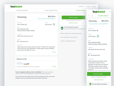
A quick little riff on a confirm and book page (not used). My thought was to put the most important information in a scannable line that would drive users eye to the CTA, with all other details secondary. Mobile web would have the stepper break down and have the CTA anchored to the bottom of the viewport.
More by Zoe Sinner View profile
Like
